Attention: this article ends with copy-paste prompts. If you just want the prompts, scroll to the bottom. If you want them to actually work, read the article first.
You have an app. People are downloading it. The number on the store page climbs, and that feels good.
So let me ask you something. Is it really working?
I do not mean "are downloads up." I mean the deeper kind of working. Of the hundred people who installed yesterday, how many came back and opened it a second time? How many reached the part you are most proud of? How many will still be around on Friday, and of those, how many did you pay to bring in and will quietly disappear?
If you paused before answering, you already know the feeling this guide is about. You are flying in fog. The instruments are dark. You are steering by the one light you can see, the download counter, and that light tells you almost nothing about where you are actually going.
Here is why that matters more than it sounds. Flying in fog is how good apps quietly die. You make calls on a hunch. You pour your next hundred dollars into the channel that looks busy instead of the one that actually sends people who stay. You celebrate a great week that was really just luck, and you miss the small leak draining users one screen before the part that would have hooked them. None of these feel like mistakes while you are making them. That is what the fog does. It lets you feel fine right up until the numbers that were never real catch up with you. Knowing what your users actually do is not a nice-to-have you get to later. It is the difference between steering and guessing.
The good news is that the fog is not permanent, and clearing it does not take an expensive tool or a data team. It takes three steps, a little honest thinking, and an afternoon with your AI agent.
Let me show you how.
Chapter 1: The three steps
First, who is talking, so you can weigh the advice. I am a developer. I run a handful of websites, a couple of SaaS products, and one genuinely complicated micro-learning app that lives in the App Store and Google Play. That app, with its onboarding flow, its free and paid tiers, and a real paywall, is where every example in this article comes from. None of this is theoretical. It is the system I actually run to understand my own users, rebuilt here so you can copy it.
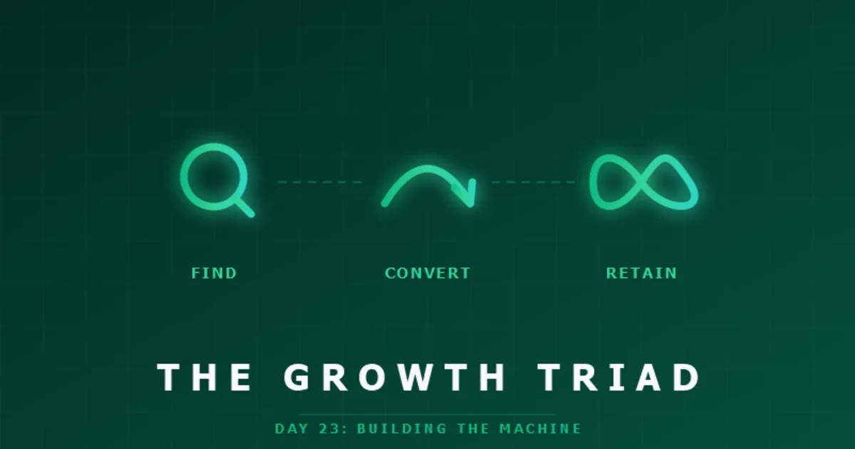
Everything fits into three steps. Write your questions. Define your metrics. Ask your AI agent to build it. Three steps, in order, and the order matters.
Step one: write down your questions
Before any code, write the questions that decide whether you keep going. The honest ones, in order, because they form a chain. People find you, some open the app, some sign up, some do the thing your app is for, and a few pay. You want to see exactly where they fall away.
Here is the exact list I track, stage by stage. Yours will look almost the same.
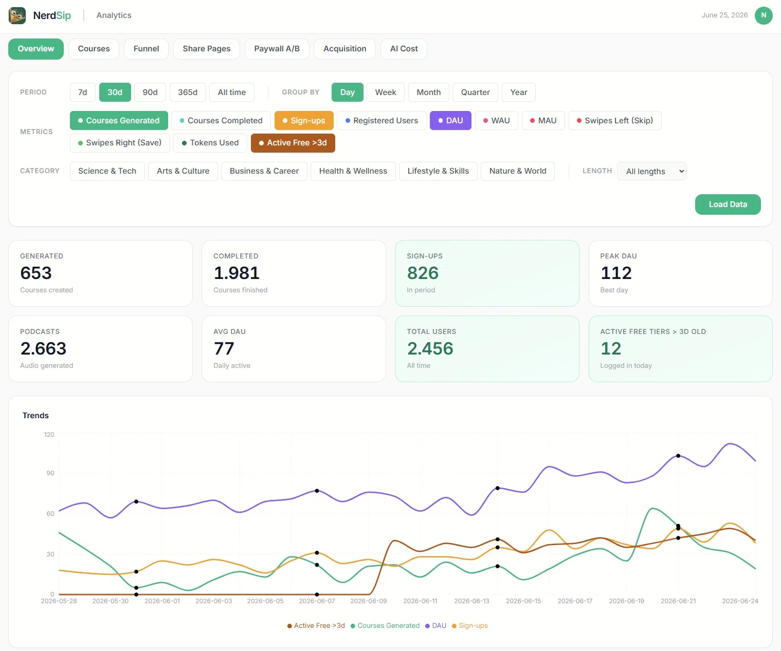
1. Downloads. I barely care. A download is the easiest number to get and the easiest to fool yourself with. A surprising number of people install an app and never open it once. The icon sits on the home screen and that is the end of it. You do not even need to track this yourself, because the App Store and Google Play hand it to you for free. Glance at it, then look past it. Nothing to build here.
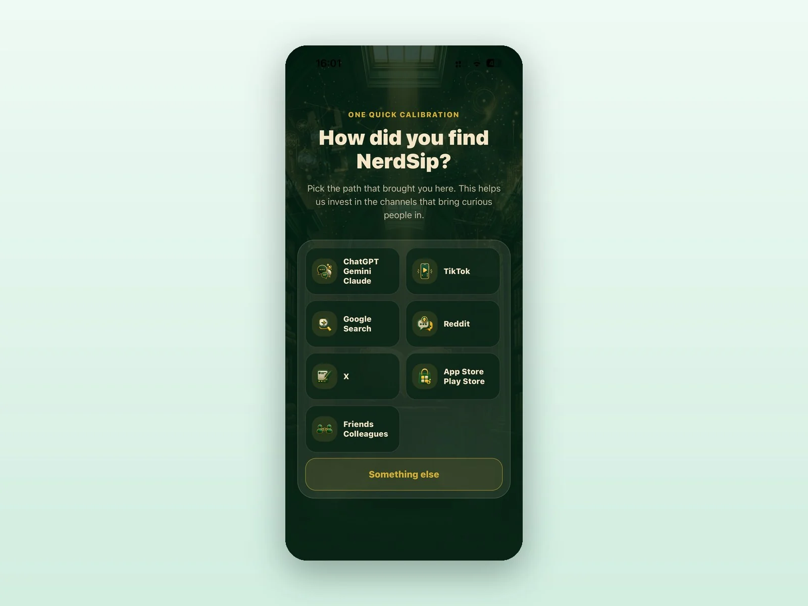
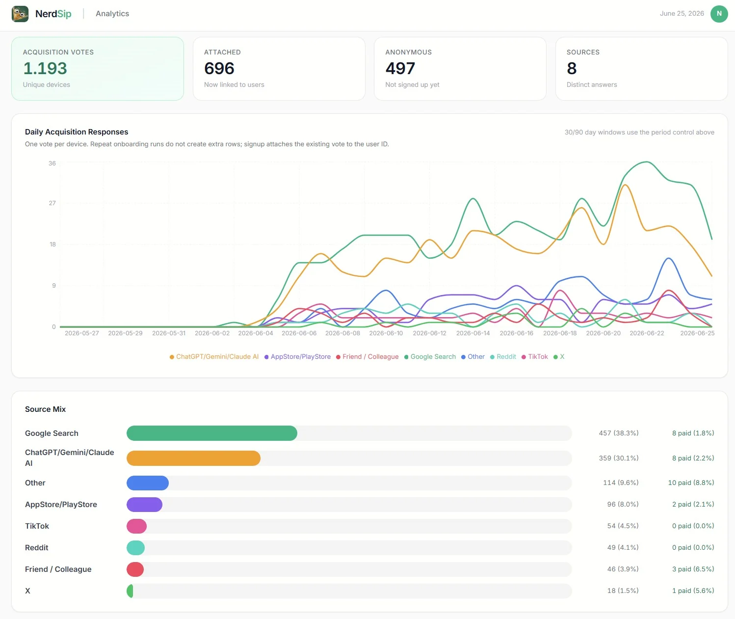
2. People who open the app and tell you where they came from. On page two or three of onboarding, ask one question: where did you find us? Google, ChatGPT, TikTok, Reddit, a friend. This might be the single most valuable slide in your entire onboarding. It does two jobs at once. It tells you which channels actually bring you humans, and the act of answering marks the first real user, the person who opened the app and engaged with it. That is my baseline, the true top of my funnel. Downloads are noise. This is the first real number. When you are ready to build it, paste prompt ATTRIBUTION from the end of this article into your agent.
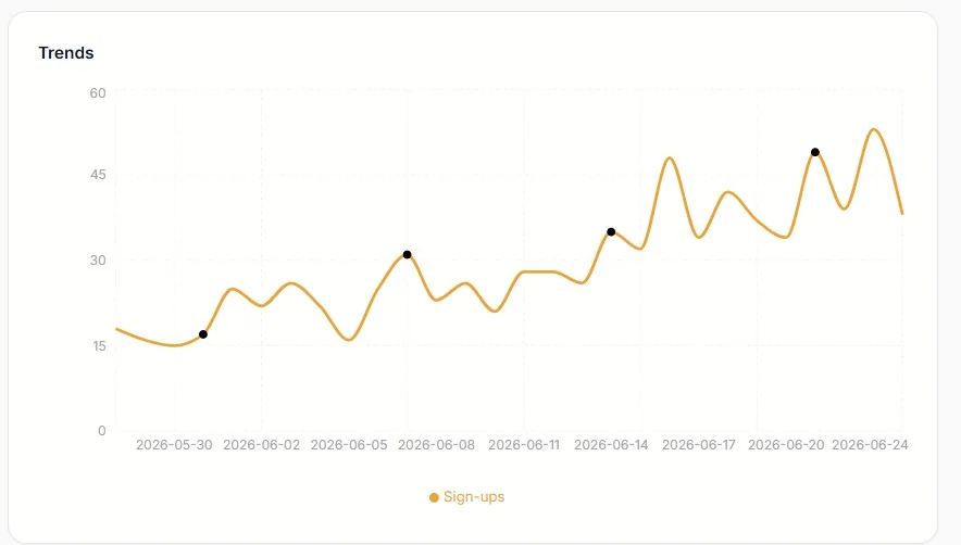
3. People who create an account. Sign up with email, or continue with Google or Apple. This is the first hard commitment a user makes. The drop from stage 2 to stage 3 tells you whether your opening minutes are actually convincing. This one comes along for free with the starter dashboard, prompt STARTER.
4. People who do the core thing your app is for. For me that is completing a course or answering a quiz. For you it might be sending a first message, publishing a post, finishing a workout, or making a first purchase. Pick the action that means a person actually got the value you promised. This is the stage that separates curious from hooked, and it becomes your definition of an "active" user. Prompt ACTIVEUSERS at the end turns this into your daily, weekly, and monthly active charts.
5. People who pay. And where those payers came from. This is the giant. It has two parts. The first is how many convert, which everyone tracks. The second is the part founders almost never connect: of the people who paid, where did they find you back at stage 2? Wire those two numbers together and you will usually find something that changes how you spend every marketing dollar. In my experience, users who arrive from Google or ChatGPT convert to paid at two to ten times the rate of users from TikTok. Same app, same paywall, wildly different value depending on which door they walked through. If all you watch is signups per channel, TikTok can look like your big winner. Line it up against who actually pays and the picture flips. This single connection is the most profitable thing in this whole article, and it is only possible because the data is yours, sitting in one place. Prompt CONVERSIONBYSOURCE at the end builds exactly this chart. If I could only build one thing on this list, it would be this.
6. If you have tiers, the questions multiply. I run a free tier and a paid tier, so I also watch how many free users are active each day, how many paid users are active each day, how many free users with an account older than three days are still showing up (the honest retention number), and how often paid users come back to log in. Paid users who quietly stop logging in are paid users about to cancel. Prompt TIERS at the end builds these.
Write your own version of this list. Five or six stages is plenty. And notice how attribution, stage 2, threads through the whole thing. It is the lens you look through at every stage below it, all the way down to who pays.
Step two: define your metrics
The list looks simple. Defining each stage precisely is where it gets slippery, and this is the step people rush. I have a PhD in physics and measurement still humbles me. A number is only as honest as the definition behind it, and most dashboards hand you the number while hiding the definition, so you never get to ask whether it means what you think.
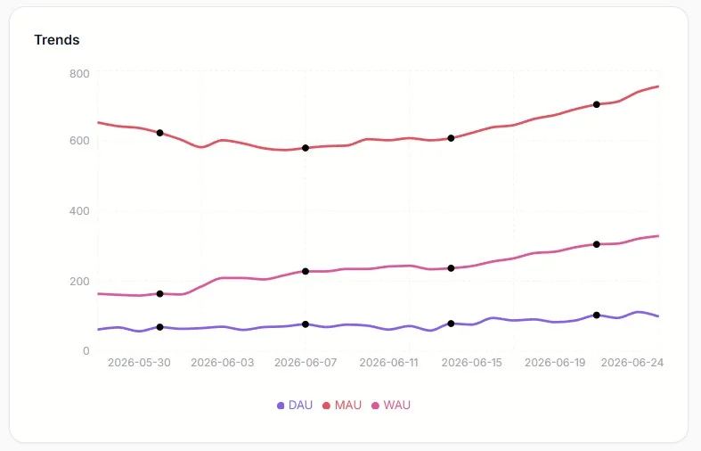
Take "active user," the famous one behind daily, weekly, and monthly active users. DAU, WAU, MAU. Active how? Opened the app? That counts someone who tapped the icon by accident and closed it again. You have to decide, on purpose. I define active as doing the stage 4 action, the core thing: completing a course or answering a quiz. Real contact with the value. You will choose your own. The only thing that matters is that you choose it, write it down, and know exactly what your number means.
Then there is the metric that will quietly lie to you. MAU. Picture turning on ads. Installs climb, seventy a day, more than two thousand in a month, and your monthly active number sails up and to the right. You feel unstoppable. Look closer a week later and almost every one of them opened the app once and vanished. During a season of paid growth, MAU mostly measures your ad budget. It feels like progress and tells you almost nothing.
That is why stage 6 matters so much. Count, per day, the free users who were active and whose account is older than three days. That one filter throws out the first-day curiosity and the install spike, and leaves the people who came back after the excitement wore off and still did something real. The number is smaller and a little humbling. It is also one of the truest things you will ever measure about your app.
Settle the awkward edges while you are here. Someone signs up and never returns. They count as a signup. They do not count as an active user. Keep those two ideas in separate boxes and a lot of confusion disappears. Someone signs up twice? Decide to ignore it for now and move on. Perfect counting can wait. Honest counting cannot.
So for each stage, write one plain sentence: "I count this as X." That sentence is the entire job of step two.
Step three: ask your AI agent to build it
Now the part that used to take a team takes an afternoon.
You do not need a data warehouse or a fleet of tools. You need three small things, and your agent can build all of them while you watch. This whole step is prompt STARTER at the end.
First, an events table. Every time something interesting happens, you save one row. A signup is a row. A completed purchase is a row. A "where did you find us" answer is a row. Each row carries a type and a time, and any extra detail you want, like which user or which source. Your app already talks to a backend, so this is one more save.
Second, a page that counts those rows per day and draws bars. Time goes along the bottom. The count goes up the side. One chart per question. Signups per day. Active users per day. Paying users per day. Bars and lines are enough to run a company on.
Third, a password. You put a secret token in your backend, and the page asks for it before it shows anything. That is your whole login. Host the page on the frontend you already have, or drop it on a free Cloudflare Pages project, and now you have a private dashboard at your own address that only you can open.
That is the starter. Open it every morning and you already understand your app better than the download counter ever let you.
Build it up, one stage at a time
Once the skeleton exists, you grow it one chart at a time, and each chart answers a question you actually have today. Each one below maps to a prompt at the end of the article.
Add the active-user chart with the definition you chose (prompt ACTIVEUSERS). Add the funnel that walks from your baseline down to paying, so you can see which stage loses people (prompt FUNNEL). Then add the one chart that tends to change how founders spend money: paid conversion broken down by acquisition source (prompt CONVERSIONBYSOURCE). The first time you see that the channel sending you the most signups is not the channel sending you the most payers, you will never look at your marketing the same way again.
Each new answer is one new event type and one new chart. The dashboard bends to your questions instead of forcing you to bend to it. And because the data lives in your own database next to your real product data, you can ask things no outside tool will answer for you, like whether the users who arrived from one source are the same ones who pay three weeks later. When the events are yours, that answer is one query away.
A peek at the tech, in plain words
Two ideas make this fast and cheap to run as you grow. Both are simpler than they sound.
Snapshots
Counting raw rows live is fine when you are small. Once you have a lot of events, you do not want the page to read every single row each time it loads. So you run a small job once a night. It looks at yesterday, adds everything up, and writes a single summary row for that day: this many signups, this many active users, this many paying, this many from each source. We call that a snapshot.
After that, your dashboard reads one tidy row per day instead of millions of raw ones. You keep saving the raw events so you never lose detail, but the charts read the snapshots and load in a blink, even after a year. A whole year is just three hundred and sixty five little rows. You will not need this on day one, and when you do, it is prompt SNAPSHOT at the end.
Indexing, explained like you are ten
Imagine a thick book with no index at the back. You want every page that talks about dragons. With no index, you start at page one and read every page to the end, just to find them all. Slow.
Now add an index at the back. You look up "dragon" and it says: pages 7, 42, and 88. You jump straight there. Fast.
A database index is that back-of-the-book list, but for your rows. You tell the database "I am going to look things up by day," or "by user," and it quietly keeps a sorted little list so it can jump straight to the rows you want instead of reading all of them. When your dashboard asks for "all events on Tuesday," the index is what makes the answer come back instantly. The STARTER prompt already asks for the right indexes, so you get this for free.
A fair word on the limits
You will not get session replay videos. You will not get a point-and-click report builder that a non-technical teammate can drive. Every event is one you decided to record, which means you have to think about what you measure. For this kind of work, that thinking is the entire point, so I count it as a feature. Know the trade and go in clear eyed.
For a solo builder or a small team with an AI agent, the deal is a sweet one. You own your data. You pay nothing per event. No one else watches your users. And the dashboard answers your questions, in your definitions, on your own little page.
The prompts. Hand these to your agent.
Everything above is the thinking. Here is the doing. Paste a prompt into your AI coding agent and let it work. Start with STARTER, then add ATTRIBUTION, then build out the rest as your questions grow. Tell your agent your stack first, for example "I use Convex and React" or "I use Supabase and Next.js," and it will fit the code to you. Wherever you see square brackets, swap in the details of your own app.
Prompt · STARTER
I want a minimal first-party analytics setup for my app or SaaS. Create an events table in my backend with these fields: a string type, a numeric timestamp in milliseconds, an optional userId, and an optional freeform metadata object. Add an index on timestamp and an index on type so lookups by day or by event type stay fast. Add one write function recordEvent(type, userId?, metadata?) that inserts a single row. Then build a password-protected dashboard page on my frontend. The password is a secret token stored as an environment variable in my backend, and the dashboard sends it with every request so only I can open it. The dashboard shows one bar chart with day across the bottom and event count up the side, a dropdown to choose the event type, and a date-range picker. Keep it simple and easy to extend. Then show me exactly where in my code to call recordEvent, starting with a signup event and one event for the main action users take in my app.
Prompt · ATTRIBUTION
Help me capture where my users come from, my most important metric. Add a one-question step to my onboarding, around the second or third screen, that asks "Where did you find us?" with options like Google, ChatGPT, TikTok, Reddit, App Store, a friend, and Other. When the user answers, record it on a per-user attribution row so each person is counted once, and treat answering this question as the moment a user becomes "real," which is my true baseline (since many people install or visit and never engage). Then add a stacked bar chart to my dashboard showing, per day, how many new users came from each source. Also advise me on where to place the question so it does not hurt my onboarding completion rate.
Prompt · FUNNEL
Build a funnel view on my dashboard, one row per day, with these stages left to right: opened and answered the "where did you find us" question (my baseline), signed up for an account, completed [the core action of my app, for example finishing a lesson, publishing a post, or making a first purchase], and became a paying user. For each day show the count at each stage and the conversion rate from one stage to the next. Add clear code comments defining each stage so I can adjust them later. Keep the logic simple and ignore duplicate signups for now.
Prompt · CONVERSIONBYSOURCE
This is the most important chart, so take care with it. Using the acquisition source I captured at onboarding and my paying-user event, show me the conversion-to-paid rate broken down by source. For each source (Google, ChatGPT, TikTok, and so on) show how many users arrived from it and what percentage of them became paying customers, sorted by conversion rate. The goal is to see which channels send people who actually pay, not just people who show up, so I can move my marketing budget toward the sources that convert best.
Prompt · ACTIVEUSERS
Add daily, weekly, and monthly active-user charts. First ask me to define what "active" means for my app, then use my answer. For me, a user is active on a day if they completed [my core action, for example finished a lesson or made a purchase]. Compute DAU as distinct active users per day, WAU as distinct active users over a rolling seven-day window, and MAU over a rolling thirty-day window. Draw all three as lines over a date range I choose. Add a short note on the page reminding me that MAU climbs during paid growth even when new users churn immediately, so I read it with care.
Prompt · TIERS
I have a free tier and a paid tier. Add these charts: free-tier active users per day, paid active users per day, and the retention number I trust most, which is free-tier users who were active that day AND whose account is older than three days (this filters out first-day curiosity and install spikes). Also show me how often paid users log in, for example average logins per paid user per week, so I can spot paid users who go quiet before they cancel. If I do not have tiers, skip this and just track active users.
Prompt · SNAPSHOT
My events table is getting large and the dashboard is slow because it scans every row on each load. Add a job that runs once a night, sums up the previous day, and writes a single summary row for that day with the counts I care about, like new users by source, signups, active users, and paying users. Then change the dashboard to read these daily summary rows instead of scanning raw events. Keep saving the raw events so I never lose detail. Show me how to backfill summaries for the days that already passed.
Just get started with the basic board. Paste STARTER, get one bar chart onto a password-protected page, and watch it fill with real numbers. The moment you see it working, something clicks, and you realize this is genuinely easy to build. From there you will be adding your own charts and answering your own questions faster than you expected, each one a small prompt away. A simple dashboard you built yourself will 10x your understanding of what is actually going on in your app. The fog lifts. You can see where you are going. Go build it.
Frequently Asked Questions
Do I need a third-party analytics SDK like PostHog or Mixpanel?
No. You can store events in your own database and read them on a small private dashboard. You own the data, pay nothing per event, and can join analytics to your real product data, which most third-party tools cannot do.
What counts as an active user?
You decide, on purpose. A good definition is a user who did the core action of your app, like completing a lesson or making a purchase, rather than simply opening the app. Write the definition down so your number always means the same thing.
Why is monthly active users (MAU) misleading?
During paid growth, new installs inflate MAU even when those users churn immediately. It can rise steadily while almost no one sticks around. Track daily active users and a retention metric, like free users active after three days, for a truer picture.
How do I keep the dashboard fast as data grows?
Add database indexes on the columns you query by, and run a nightly job that rolls raw events into one summary row per day. The dashboard then reads a few daily rows instead of scanning millions of raw events.
📚 Keep Learning
See it from the inside
NerdSip is the micro-learning app these examples come from. Try it, and watch your own "where did you find us" answer land in a dashboard like this one.